Nissan Logos over the years
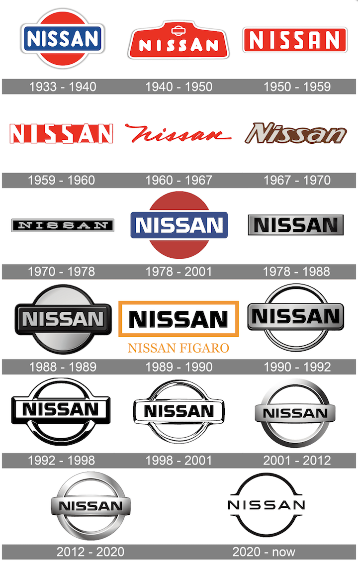
The history of the Nissan logo features several variations of the Nissan emblem, all of which feature the shortened name of the brand “Nissan”. Though the organisation has experimented with a range of styles and designs over the years, the current Nissan logo is a modern, attractive image featuring the “Nissan” title written in all-capital sans serif font, and a circular badge. There are two versions of the Nissan logo currently in circulation. One is the badge you’re likely to see on the Nissan cars from 2020 and before, with a full chrome circle and a thick silver bar showcasing the “Nissan” wordmark.
The new Nissan design replaces the thick silver badge with a simple black outline. In this version of the logo, the circle is separated into two halves by the wordmark in the centre. Both versions of the logo aim to demonstrate modernity, creativity, and exclusivity.
The Nissan Company was officially founded in 1933. The brand traces its origins back to some of the earliest days of automobile manufacturing, and today is one of the biggest motoring companies in the world. Nissan has been part of the Renault-Nissan-Mitsubishi alliance since the end of 1999, and it’s currently the 6th largest automaker in the world.
In 2014, Nissan announced it had hit the top spot as the largest car manufacturer in North America. By 2018, Nissan had earned the position of the largest electric vehicle manufacturer worldwide, with global sales of more than 320,000 fully electric vehicles.
The increasingly modern identity of Nissan is reflected in the company’s choice of symbol.
Nissan car logo evolution: Nissan logos through history
The Nissan car symbol has seen several changes over the years. The company always aimed to maintain a clean, easy-to-recognize image with its emblems, which may be why many of the elements of the old Nissan logo, and the new Nissan logo are the same.
1933
Despite appearing decades ago, the original Nissan logo was a sleek and modern symbol, designed in red, white and blue. The red circle was representative of the sun, while the blue rectangle was meant to indicate reliability. The wordmark for Nissan was written in all caps, with a bold sans-serif type.
1940
The first Nissan logo change happened in 1940 when the company began experimenting with colours and shapes. The blue rectangle was removed, and Nissan embraced an odd geometric shape, similar to the front portion of a car. The wordmark was executed in a hand-drawn, friendly typeface, with an enlarged letter “A” ” The “rising sun” emblem previously used by Nissan also appeared in this version of the logo, just above the wordmark.
1950
The Nissan emblem changed again in the 1950s, during which time the company simplified its image to feature a wordmark on a simple red, rectangular background. The red rectangle featured curved edges and a thick white border, matching the colour of the brand name. The font here was stronger and more angular, and all letters were the same size. In 1959, Nissan also experimented with a different version of this logo, in which the letters of “Nissan” were enlarged to hang over the rectangular background. This Nissan symbol only remained in use for around a year.
1960
Experimenting once again with typography, Nissan introduced a completely different form of the Nissan logo font in 1960. Here, we saw a sentence-case version of the word “Nissan” written in italic, cursive typography. The red wordmark sat atop a white background for a minimalist look. When placed on cars, the word was written in silver, to help it appear as stylish and expensive as possible. This unique iteration of Nissan’s brand identity was intended to convey elegance.
1967
Throughout the end of the 1960s and the beginning of the 1970s, Nissan explored a couple of additional typography choices for its logo. In 1970, the italicized logo abandoned its cursive elements and took on a broader, bolder appearance, improving legibility. Nissan also replaced the bright red colouring with a brown colour palette. Nissan quickly replaced this image with another alternative, this time featuring silver font on a black background, with a thin silver border. The font in this Nissan logo choice was completely different again, this time written in all capitals, with a serif finish.
1983
In 1983, after what appeared to be a decades-long identity crisis, Nissan returned to its roots, restoring the “rising sun logo”, alongside a much larger wordmark, written in sans-serif all-capital type. The lettering here is strong and confident, and the colour palette of red, white, and blue returned.
2001
In 2001, Nissan simplified and updated its logo for a modern audience, introducing the silver version of the logo most of us know today. This image is still present on some Nissan cars, showing the title “Nissan” on a silver banner over a matching silver circle.
2020
In 2020, a minimalist version of the previous Nissan logo was introduced. The font is slightly thinner here, and the circular border surrounding the wordmark is much sharper.
The circle is split into two distinct sections by the name “Nissan” which uses the whitespace in the logo as a kind of banner. Though the current version of the logo is certainly far more modern than the company’s original logo, it’s easy to see the connection between the two. The visual identity today immediately conjures ideas of creativity, community, and innovation, particularly when linked to the image of the Japanese rising sun.
Nissan logo colours: The colour of the Nissan logo
Officially, the Nissan logo colour is simply a black image on a white background. However, there are several Nissan colours owned by the brand.
What font is the Nissan logo?
As you can see in our history of the Nissan logo above, the Nissan font is one of the major design elements the company changed several times over the years. The Nissan logo font has evolved through a host of different typefaces, from friendly handwritten styles to italic masterpieces. The current font of the Nissan logo is a custom-made brand typography, created in a geometric sans-serif design. Usually, the word “Nissan” is written in black for branding purposes. Celebrating the Nissan logo today
The Nissan logo today is one of the best-known images in the automotive industry. The chances are you can easily spot a Nissan car, regardless of whether you’re a fan of the brand, thanks to the iconic Nissan symbol.